A logo is not just a picture. It is the DNA of your brand compressed into a visual symbol. For small businesses, you can try to create a logo online through a logo generator, but remember: such solutions rarely take into account the depth of the brand. Start with the questions that few people dare to ask: Why does this company exist? What customer problem does it solve? What emotions should it evoke? And SELECTOR.SPACE will help you with the implementation.
Logo: mission and values
An eco-brand that fights against plastic will choose a symbol of the cycle rather than abstract shapes: a looping arrow, earth colors, and textures reminiscent of nature. A geometric, fashionable pattern will fail here — it is voiceless.
Take a look at the Privatbank logo or the Monobank logo — their elegance and technology reflect financial reliability.
Let’s take a closer look:
- A language that customers understand. “Lux Cosmetics” for women is full of gold embossing and serialized fonts. The gaming startup explodes with contrasting colors and shapes, as if cut by a sword. And for those who buy eco-products with a sense of responsibility, the symbol is not a leaf but a plant that breaks through concrete.
- Competitors: where are your doors? When Slack was creating their logo, they saw that everyone was using clouds for socializing. So they decided an octagon, a symbol of versatility. Your task is to find something that is not yet occupied.
- What is the story about? The Tesla logo is not a car, but an arrow of progress. FedEx is not logistics, but an arrow hidden between the letters that whispers: “Fast and accurate”. An abstraction without a story is like a face without features: you can like it, but not remember it.
- A fatal mistake. “Sell coffee — draw a cup” is a cliché of the 2000s. Is the coffee shop about community? Let the logo have intertwined lines.
The best logos are the ones that make you think. They do not shout about services, but tell why the brand exists. And it is this “why” that makes them memorable.
Logo and simplicity: power compressed into a form
If you’re experimenting on your own, logo creation programs like Canva will help you with sketches, but for a professional solution, you’ll need a designer.
A logo is not a canvas for art, but a business card that the brain recognizes in 3 seconds. Just like Apple or Nike: no metaphors, just the essence. Simplification is not a loss, but a concentration.
Let’s take it point by point:
- A logo is about speed. Our brains crave speed: a complex design with gradients and shadows becomes noise. The logo should be readable on a favicon (16×16 pixels) and live for decades. Circle, square, wave — shapes that defy time.
- How to achieve simplicity? Start with a black and white sketch. Remove everything that does not explain the brand: decorative lines, 3D effects. Check with the “5 seconds” rule: what is memorable? If it’s not a key element, simplify it.
- The genius is in the details. WWF — panda silhouette, McDonald’s — two arches, Adidas — three stripes. No colors or text, just emotions. Even the Amazon arrow from A to Z is not just a symbol, but a promise: “We have everything.”
- Mistakes that ruin a logo. Wavy lines “for creativity”, an attempt to fit all the values into one symbol, long text in the logo — this turns it into a puzzle without meaning.
The perfect logo is like a haiku: minimum words, maximum depth. Delete 30% of it after it seems like there is nothing to delete. Leave only what people will draw on a napkin years later. Simplicity is not emptiness. It is the accuracy of a sniper.
Logo and color: a language the subconscious understands
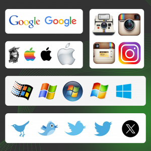
Pay attention to the Google logo — its colors are not accidental. And the Facebook logo is blue for trust.
Color influences decisions faster than words. Choosing a palette is not about choosing shades, but about encoding brand emotions in 2-3 colors.
Important things to know:
- Forget about templates. Blue can be stability (IBM) or cold (luxury cosmetics). Red can be fast food energy or exclusivity (red Louboutin soles). Green is not only about the environment: Starbucks is about luxury, Spotify is about youth.
- How to find “your” colors? A bold brand? Fuchsia + black (MTV). Conservative? Burgundy + gold (Ritz-Carlton). Innovative? Purple + acid yellow (Twitch). Limit the palette, if you use more than 3 colors the chaos begins.
- Technical nuances. 8% of men are color-blind: red and green combinations can turn gray. Check the logo in Coblis. The black-and-white version should work without loss: if the silhouette is not readable on a stamp or embroidery, it’s a failure.
- Examples to guide you. Coca-Cola makes you thirsty with red, Tiffany — status with blue, Instagram has become a cult because of the gradient that conveys creative chaos.
- What kills a logo? Choose a color based on the founder’s preferences. Adding “gold” to make it premium will be cheap. Ignore cultural codes: white is mourning in Asia, and an export logo should take this into account.
Color in a logo is a trigger for emotions, not a decoration. It should evoke “I want it” or “It’s mine”. Find the shades that match the brand’s DNA and remove all unnecessary ones. Even the most beautiful color is useless if it’s not about your story.
Logo and its font: a voice that can be heard without words
Even Telegram logos and Instagram logos use fonts that emphasize their technological and accessibility.
A font is not just text — it is the first handshake with a client. Choosing a “normal-looking” font instead of one that conveys character makes your brand look inexpressive. Helvetica or Arial is like a white T-shirt: faceless and predictable.
It’s all about fonts:
- How to find “your” font? Unpack the brand’s DNA: finance needs rigor (fonts with clear serifs), children’s brands need playfulness (rounded shapes with unexpected elements), and luxury needs elegance (thin lines and custom sketches). Break the mold: Ray-Ban combines bold type with sharp edges to convey boldness and class.
- Technique vs. Emotion. The font should work on media from screens to signs: avoid ultra-thin lines, check the readability of the Cyrillic alphabet (“I” vs. “Y”), test against a contrasting background. A custom font is worth creating if the brand is unique (Netflix with a movie film in the outline) or competitors use similar solutions.
What kills a logo?
- Crowd of fonts (maximum two).
- Blindly copying trends (for example, “handwriting” after 2020).
- Jokes with readability (swirls where “I” becomes “C”).
- Attempts to “be for everyone”: modern, classic, and playful at the same time.
The perfect font is like a perfectly tailored suit: it doesn’t attract attention by itself, but emphasizes status. It speaks in the tone that the brand needs: from a serious whisper to an energetic shout. If you get it right, customers won’t even notice the font. They will just feel it: “Yes, that’s them.”
The logo and its uniqueness are an eternal trend

A logo created with fashionable effects ages like low-waisted jeans: in a year it’s funny, in three years it’s shameful. Today’s wavy gradients or 3D folds are tomorrow’s kitsch. But there is a secret: uniqueness has no expiration date.
Trends are the enemy of the brand because they turn the logo into a faceless background among the same “cool” effects. Remember the flat designs of the 2010s: millions of twin brands. Trends live with each other
How to dig up uniqueness?
Forget about Pinterest. Look in the brand’s DNA:
- Mythology (Starbucks with a mermaid from an engraving).
- The history of the founding (Amazon’s arrow that takes you from A to Z).
- Unique feature (Michelin is a symbol of traveling tires).
The strongest logos are abstractions that hit the heart without explanation: the red Shell, the WWF panda, the Twitter bird.
A unique logo is a melody that you can’t get out of your head. It doesn’t shout, it echoes.
Chameleon logo: survive on any medium
It should be clear both on a billboard and in a 16×16 pixel favicon. A blurry symbol on a freebie or an unclear silhouette on an embroidery is a lost opportunity. Its strength lies in its ruthless simplicity that can withstand any conditions.
The YouTube logo with its “player” icon is an example of adaptability: it is clear on a smartphone screen and on an advertising banner.
Important things you need to know:
- Favicon is your mini-advertisement: millions of views every day. The large format requires perfect details. Adaptability is the language of the future: the logo should work on a hologram, metal engraving, AR glasses.
- How to achieve it? Vector graphics are the only option. Raster images will crumble when scaled. Simplify to a minimum: if the fingernail-sized logo is unreadable, remove the small details, increase the gaps, make the outline thicker. Create 3 versions: horizontal, vertical, and an icon without text (like on Twitter).
- Examples for reference. Adidas: three stripes are the same on the sneakers and the emblem. Nike: a checkmark that does not change from bottle to neon. Twitter: a bird that doesn’t lose its shape even in 16 pixels.
- What kills a logo? Gradients that fall apart when printed. Complex icons with mountains and rivers that turn into spots on a business card. Long names — IBM was shortened because “International Business Machines” would not fit.
- Technical secrets. Export in 5 sizes — from 16×16 to 5000×5000. Make the outline a line, not a full, to prevent blurring. Check on contrasting backgrounds.
A scalable logo is like water: it takes on the shape of a vessel without losing its essence. Remove everything that breaks when you zoom out. Leave only what will survive the digital storm. When it’s equally impressive on a watch screen and a skyscraper facade, you’ve won.
A logo that embraces emotions
It doesn’t have to be just pretty — its power is to be felt. 95% of purchasing decisions are made subconsciously: a logo that touches emotions becomes “yours” before the client reads the name. Memory captures feelings, not shapes, which is why red Coca-Cola evokes nostalgia for the holidays.
The logos of clothing brand like Nike use minimalism to evoke movement and freedom.
How to embed an emotional code in a logo?
- Geometry with character: symmetry (BMW with a propeller ring) conveys stability, asymmetry (Mitsubishi diamonds) conveys energy.
- A hinting symbol: FedEx’s hidden arrow represents speed, Amazon’s broken line is a smile from A to Z.
- Contrast like a punch: black + bright yellow (Lipton) or sharp angle + soft wave (Adobe) breaks patterns.
Hearts for love, globes for internationality — it’s fast food for the subconscious. Trying to fit the entire brand mission into a logo is like telling War and Peace in one emoji. Emotion without context is just an art object, not the face of the brand.
The best logos are those that become a bridge between the brand and the customer’s memories. They are not “liked” — they are felt. Find the note that resonates with the dreams of your audience. Even a simple symbol will then become a magnet for hearts — like a melody that cannot be forgotten.
Logo and testing: finding the brand voice among the noise
Before ordering a logo design, test your sketches with clients. Some logo generators allow you to do this for free.
A logo without a test is like a letter in a bottle: it might float, but why take the risk? Feedback is a compass that shows whether your symbol speaks the same language as your audience.
Your team sees the logo through the prism of experience, while the client sees it for the first time. A person will read abstractions with the words “innovation” as “a ball with lightning”. Details kill the first impression: while you are talking about the “deep meaning”, the client has already stored their first impression in their subconscious.
The main point:
- How to find out the truth? Do not ask, “Do you like it?” — ask: “What causes it? What company does it represent? Will it be memorable?” Test among strangers — friends may embellish the reality. Show two options: “Which one is more reliable? Is it more expensive?”.
- Iterations: when to stop? Look for patterns, not individual opinions. If 7 out of 10 people see medicine in a coffee shop, it’s a signal. But if one person says, “it looks like a spider,” it’s their imagination. Don’t try to fit all your wishes into one logo.
- This is a killer mistake. Test when the logo is 90% ready — minor edits will not save a failure. Ignore the “zero” audience — it is the one who gives honest feedback.
Testing is like archeology: you dig through the layers of perception to find the idea that resonates with the majority without losing the essence. 80% should understand the logo, 20% should love it. But if everyone “doesn’t hate” it, you’ve lost. Because neutrality is the worst crime in branding.
Courage is to admit that the first idea is not perfect. Letting go of your favorite element that doesn’t work. Stop when the logo causes a “wow” even for those who don’t know it’s you.
Long-lived logo: when trends die but history remains
Chasing trends is like building a house on sand: a wave of gradients today will become a funny archive tomorrow. A logo is not a stylus for TikTok, but the visual DNA of a brand that should survive AR glasses and neural networks.
Mercedes or BMW car logos haven’t changed for decades — their classics survive trends.
Trends are poison. They turn brands into clones (think of the millions of flat logos of the 2010s) and date them by era. The trendy 3D effect will become a pixelated nightmare tomorrow, and the neon gradient will become an analog of low-waisted jeans.
How to build for centuries?
- 80% are classics: circle, wave, triangle (Shell, Twitter, Mercedes). These shapes spoke the language of symbols a thousand years ago.
- 20% is trendy accent: color of the year or texture. Like Burger King: a fiery character in a modern flat wrapper.
Imagine the logo in a movie from 2050. Sound funny? Remove the neon outline and look has it lost its meaning? Then stick to the classics.
Common mistakes:
- If you customize a suite to fit the trendy fashion, you will lose your audience.
- Be afraid of neutrality. A black dress is eternal if you add an accessory.
- Web3 pixels in a logo are like a hashtag tattoo: you’ll be embarrassed in a year.
A real logo is like wine: it gains depth over time. It is based on a symbol that needs no explanation. The trendy accent is temporary makeup. When it is washed off, the brand essence will remain. Don’t ask: “How does it look now?” Ask: “What will people say about it in 10 years?”.
Professional tools: why a logo is not a DIY game
Even if you decide to create a logo for free, you will have to finalize it in a vector later. Logo design requires knowledge of color models (Pantone, RGB) and adaptation to different media.
Creating a logo in Canva is like baking a cake in a toaster oven: technically possible, but the result is questionable. A logo is not a picture, but a technical artifact: it has to live in a vector, be printed on metal and embroidery, and scale from a favicon to a billboard. Here, professionals are not a luxury, but a necessity.
Why is DIY expensive?
- Canva is only for sketches. A PNG file will crumble when you zoom in, a vector from Illustrator is the mathematical accuracy of each line.
- Figma is not for drawing, but for testing: how the logo will interact with other brand elements.
The colors on the screen do not equal the colors on the print. A professional will convert RGB to - Pantone, take into account the foil on the package, and warn you about color blindness (8% of men won’t see your red-green contrast).
When do you need an expert?
If you don’t know what kerning is (millimeters between letters) or think that vector is “about geometry”. The Airbnb or Spotify logos seem simple, but behind them are years of testing, cultural codes, and technical requirements.
Here are 5 mistakes amateurs make:
- Export to JPG;
- Ignore the monochrome version;
- Gradients without understanding of printing;
- “Bloated” vectors;
- Texts that are not readable.
A logo is a technology, not a drawing. Entrust it to us — a team that knows how to turn your idea into an eternal symbol. Otherwise, in a year you will spend 5 times more on fixing mistakes instead of relying on a professional from scratch.
Remember: professional tools give you freedom, not complexity. A professional is an investment, not an expense. After all, a logo that doesn’t work is worse than no logo at all.
Conclusion
Even if you use an online logo generator, don’t ignore the experts. A logo is not just a picture — it’s an investment in recognition. Sometimes it’s better to spend time designing a logo than to redo it later because of mistakes.
A memorable logo is a combination of simplicity, emotion, and a deep understanding of the brand. Take your time: it may take months to create the perfect version, but it will be the face of your business for years to come. Start with analysis, experiment with shapes and colors, and don’t forget about legal protection of the finished design.
Do you want to order a logo? Our specialists have extensive experience and understanding of all the important factors in creating a high-quality and effective logo. Don’t hesitate to contact us — we will be happy to help you and provide advice. Find more interesting posts in our blog. You can contact our digital agency by phone at 066 389 02 24, 096 81 00 132, or by email at office@selector.space.
Follow us on Instagram, Facebook, TikTok, YouTube, and Pinterest.
